Study In Contrasts – Ye Cannot Serve God And Mammon
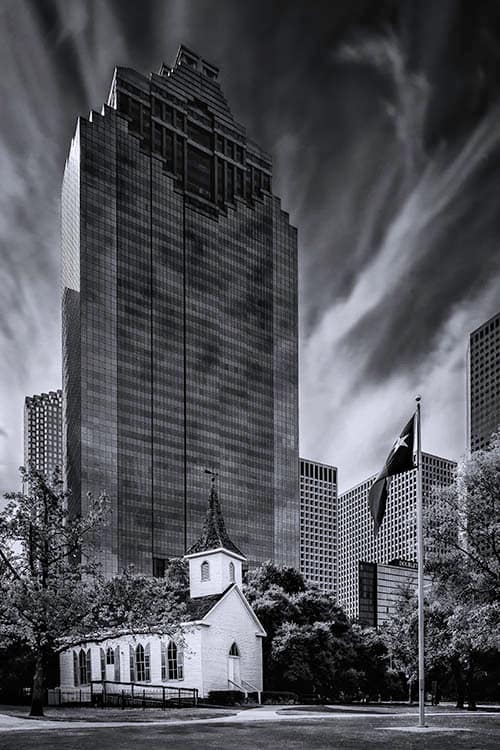
Sam Houston Park sits at the edge of, you guessed it, downtown Houston. It contains 10 buildings representing the buildings and culture of Houston’s past. One of these is St. John Church. Built in 1891 in northwest Harris County it was relocated to Sam Houston Park in 1968 and has become a Houston landmark. I think a good part of this landmark status is derived from the view of the church set against the Heritage Plaza skyscraper located just outside the park. For me, it represents a study in contrasts.
There are of course, the architectural aspects of the two buildings: old versus modern; small versus large; and, wood versus glass and steel. At the risk of over-anthropomorphizing, Heritage Plaza can also seem to be a dark, dare I say evil, presence looming over the church below. The top built to resemble a Mayan temple has the appearance of dark, soulless eyes.
However, I believe the most important contrasts are in what each building represents; godliness and spirituality versus commerce and materiality. I’m not a religious person but I couldn’t help but think of the Bible verse (Matthew 6:24):
“No man can serve two masters: for either he will hate the one, and love the other; or else he will hold to the one, and despise the other. Ye cannot serve God and mammon.”

(Click to enlarge/purchase)
The Composition
Finding the right composition was a bit tricky. As it turned out, the difficulty I experience resulted in what I think is a better composition than the composition much closer to the flagpole that I was originally working on. I had decided to use my 24mm tilt-shift lens to better control perspective. However, given the close proximity of the 53-story Heritage Plaza building I could not fit it all in frame even at maximum vertical shift on the lens. In this instance, I had no choice but to back up to get the entire building in view. Unfortunately, the ground slopes down to Buffalo Bayou. So, everything I gained by backing up I lost by going to a lower elevation. It was a no-win situation.
While standing there in frustration, I noticed the ground to the left had a much gentler slope. Perhaps, I would have more luck in finding the right distance and elevation there. Fortunately, by moving to the left I was able to find a workable spot. My original composition did not include the flagpole. The new composition gave me a more pleasing view as it was not so directly aligned with the buildings and the flagpole offers a nice balancing element. Sometimes you just get lucky.
Taking The Shot
The gear and settings were:
- Canon 5D Mk III, Canon TS-E 24mm f/3.5L II Tilt-Shift Lens at 12mm vertical shift, Induro AT013 tripod, Induro BHL3 tripod head, Shutter Release Cable, 9-stop neutral density filter
- 15 seconds at f/18, ISO 100, mirror lockup setting used to minimize vibration
As with the Smith Street shot, the use of mirror lockup and a shutter release cable are small details but I believe the small details are what set a great photo apart from a merely good photo. It’s not for me to judge whether or not this is a great photo but I’m going to do whatever I can to make it so; especially when the effort required is so minimal.
Post-Processing
As always, I started in Adobe Lightroom by verifying the verticals were true and adjusting if needed and reviewing the entire image at 100% to view and remove sensor spots and other similar distractions. Lightroom does have a “show spots” feature which is nice but I prefer a closer, manual inspection to better see and judge spots and other flaws.
Knowing that the green vegetation would be very dark and lose detail when I converted to black and white I lightened the tone by using the yellow saturation slider. I could have used the green slider but yellow typically has a more direct effect.
In Photoshop the first thing I did was to set the composition. Although I was able to get all of the Heritage Plaza building in the frame, there was not enough “breathing room” at the very top. The top of the building was too close to the edge. To correct this, I expanded the canvas vertically and using content aware added a bit of sky. Wanting to maintain the original aspect ratio, I cropped out an equal amount at the bottom of the photo which simply removed some un-needed empty grass area.
I had intentionally chosen a 15-second exposure to get a nice cloud movement effect which I think worked out nicely. This exposure time also brought in movement blur on the flag which was not so nice. In order to offset this, I used layer masking to bring in the flag from original exposure without the ND filters. This static flag fortunately had the Lone Star prominently displayed, an unexpected delight.
The Conversion To B&W
I felt a B&W conversion would emphasize the study in contrasts I was aiming for. I converted the image to B&W using the Nik Silver Efex’s Low Key 1 preset. My most significant adjustments were to the underlying color to achieve the desired tones in B&W. Using the yellow color filter slider, I further lightened the tones of the vegetation. This kept them from being a massive blob of very dark tones with little detail. I also darkened the sky using the blue film sensitivity slider.
The warm morning light created wonderful tones on the left side of Heritage Plaza. However, this lighting also put the front of the building in shadow. My use of the blue film sensitivity slider in Silver Efex also darkened the blue glass of the building. This combination just made the front of the building too dark. Masking to highlight the front I lightened it up to show some detail but still maintain the dark, ominous mood.
Unfortunately, this processing also produced some haloing around the building. Using the healing brush tool, I removed the halo. Wanting to emphasize the church against Heritage Plaza as a study in contrasts, I selected the white portions of building and increased the exposure. I also brightened the church roof a slight bit to bring out more detail. Although I like the prominence of the Lone Star in the flag, I didn’t want it to be so bright as to draw your eye away from the church. Selecting the star and lowering the exposure decreased the attention it might draw and brought out some shadow detail in the folds.
My final step was in Lightroom where I did a final check for dust and sensor spots that the processing may have uncovered.
Have A Comment? Please Share
Doing a study in contrasts turned out to be a very involved process which actually made it fun and rewarding. If you liked this post please share on Facebook and Twitter and comment below. Have you ever done a study in contrasts or other attributes such as textures or detail? Please leave a comment in the comment box below.