Managing Color For B&W Photos
I recently posted about looking at a scene and visualizing it in black and white. So now that we’ve taken the photo, we need to do the post-processing needed to achieve what we visualized. Specifically, we’ll talk about the importance of managing color in our B&W photos.
Whoa! Did I really just say managing color is important in B&W photos? Dude, it’s “black and white“; there’s no color!
So why am I saying managing color is important? Good black and white photography is all about controlling the tones and contrasts in our image. One of the major influencers of tone and contrast in B&W photos is the color in the original scene. By managing color during post-processing, we can effect tone and contrast changes in the black and white photo.
Why Simply Converting To Black and White Isn’t Enough
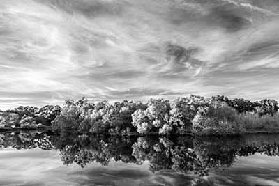
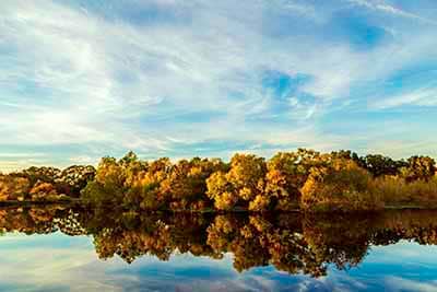
Consider a landscape with a red flower in lush green foliage under a deep blue sky. Let’s take a look at what this might look like in black and white. Below are the original colors and how they look if we convert them to B&W in Photoshop using a black and white adjustment layer at the default settings.


B&W default setting
I deliberately selected 3 colors with roughly the same tonal value to make a point. When you simply convert to B&W, we see virtually no difference in tone or contrast in the 3 converted colors. This would make for a very “flat” or “dull” black and white image. In reality, you are unlikely to find a situation this extreme. However, you will find many situations where there is not as much tonal and contrast variation as you would like. This is why I said in the Seeing In Black And White post:
“The conversion is the first step in making a good black and white. By no means is it the last step.”
Using Color Filters

CC BY-SA 3.0
When shooting B&W film in the pre-digital days we started adjusting color by using colored filters on the camera lens. These converted the tones in the scene to more closely match what we wanted the B&W film to capture.
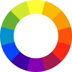
Color filters block light wavelengths other than the wavelength of the filter color. For example, a yellow filter allows yellow wavelengths through while absorbing other wavelengths. That means a filter will darken colors opposite it on the color wheel and lighten colors near it. For example, yellow and orange are good for darkening a blue sky. Film manufacturer, Ilford, has a good article on the characteristics of various color filters along with suggestions of where each color works best.
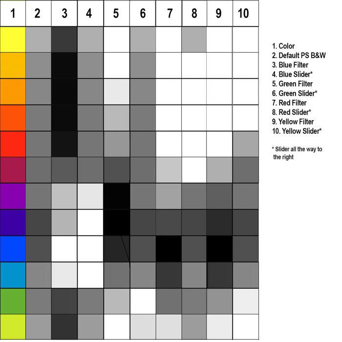
You can digitally apply color filters with Photoshop or Nik Silver Efex and other similar programs. Below we can see how various filters affect the tones and contrasts of the black and white image. Using software filters has the added advantage of allowing us to easily change the hue of the filter and strength of the filter.


Color filters provide a number of options to get the desired tone and contrast. However, the downside of color filters is that we are limited to using only one per image. Due to the way filters work you cannot “stack” filters, physically or digitally. Multiple filters simply don’t work together.
Adjusting Individual Colors
Fortunately, with software we are not limited to just the using a filter for color adjustment. This expands our range of options significantly. We can adjust multiple colors individually or in conjunction with the use of color filters. In Adobe Lightroom and Photoshop, we can adjust individual colors by means of sliders in the B&W panel/adjustment layer. Nik Silver Efex has color sliders in Film Type/Sensitivity panel. Other software packages typically also have the ability to adjust colors individually.
This individual color adjustment works differently from color filters. As a result, you need to be aware of the differences to understand how each affects your image.
- Color filters affect all colors. They darken the colors most opposite of the filter color (its complementary color) and lighten colors closer to the filter color. For example, a red filter will lighten all the red in the image. To a lesser extent it also lightens the colors close to red. The red filter will darken blues and greens and the darkening effect lessens as you get closer to the reds.
- The individual color sliders affect only the color you are adjusting and in the case of primary colors (red, yellow, blue) the colors made by mixing the primary colors. For example, the red slider only changes red items and those colors that contain that color. Basically, we are changing the color tones in the underlying color version of the image so that the B&W conversion gives the desired effect.
The graphic below shows the difference in how filters and sliders work in color adjustment. It also illustrates the wide range of control of tones that managing color provides.

Managing Color For B&W Photos As A Local Adjustment
Up to this point we have been talking about color management as a global adjustment. That is, using color filters and adjusting individual colors for the entire image. However, there may be times when we want to adjust color for black and white differently through local adjustments. For example, we want to darken the sky without darkening the blue building. If we use a red filter or the blue color slider to darken the sky, we also darken the blue building.
Using Photoshop, we can break down the photo into smaller local color adjustment layers. For the previous example we may want to select the sky and the create a new layer containing only the sky (Layer>New>Layer Via Copy). We now have 2 layers: the bottom layer is the original and the top layer is just the sky. Click on the bottom layer and make a B&W adjustment layer and then use the blue slider to adjust the blue building as we need. Next, go to the top layer and make another B&W adjustment layer and darken the sky via a red filter or the blue slider. Finally, collapse the layers and we now have separate and different blue color adjustments to different parts of the image.
Revisiting Using The Monochrome Picture Style On Your Camera
In the Seeing in Black and White post I mentioned that some people like to use a monochrome picture style to help them visualize the final image. I noted that I don’t recommend that method. Let me tell you why I made that recommendation. In this post we’ve discussed three methods of managing color to get us to the desired endpoint in our B&W photo:
- Using color filters
- Adjusting color individually
- Make local color adjustments
When using the monochrome picture style, we only have the ability to use method #1; methods #2 and #3 are simply not available to us on the camera. Methods #2 and #3 are powerful tools in managing color especially in conjunction with method #1. My feeling is that if you use the monochrome picture style you are short changing your visualization possibilities. You’ve denied yourself the the opportunity to visualize the effect of two powerful methods. I feel it is better to understand all of your options and consider them all in your visualization process.
A Final Word Of Warning
I previously discussed the issue of halos in photos; what causes them and how to fix them if you can’t prevent them. In particular, I listed pushing adjustments too far and misaligned masking as potential issues. Some the things I mentioned in this post could easily fall into these categories if you aren’t careful.
As you go through this process, periodically stop and check to see if you are creating haloing. If so, try to readjust to see if you can prevent them. If necessary, apply the halo fix. Definitely, do a final check for halos at the end.
Leave A Comment And Share
If you liked this post please share on Facebook and Twitter and comment below. I’d love to hear your comments and feedback on this post. I hope it was helpful.
How do you go about managing color when making B&W photos? Please leave a comment in the comment box below.