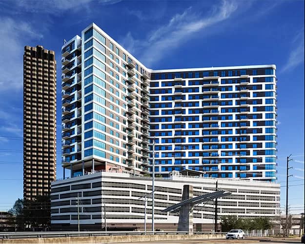
The Vantage Med Center
The Vantage Med Center was my inspiration for my last post. It was an accidental find; a happy accident. I was torn between continuing on as planned or stopping to seize the unexpected opportunity. I decided to continue on to my original destination and to hopefully return another day to capture the Vantage.
Two things about the Vantage caught my eye. First, the contrasting pattern on the façade had the real potential to make a great architectural shot. Second, there were a number of power lines spoiling the view. The power lines concerned me enough that I decided to stick to my original plan and take my changes with the Vantage another time after a more careful review of the scene.
The Shot
The careful review I mentioned was to find a good composition and further consider the power line issue. For the moment, I’ll only discuss the composition question and defer the power line issue until later in this post. In terms of composition I had what I thought were two viable options. One was a shot from the front of the building. The second option was a side view from the Wainerdi Bridge. The front view was nice but I didn’t find it that exciting. On the other hand the side view brought in some nice architectural accents of the bridge that help take the attention off of the garage levels. Both views had visible power lines.
I ultimately decided on the side view. Once I decided that I checked the Photographer’s Ephemeris to find the time of day for good lighting on the side and then waited for a good cloud day. Fortunately, I didn’t have to wait too long. Initially, I thought the contrasting pattern on the façade would work well in black and white. However, once I went down there and saw the building in full sunlight I decided to go with color. I really liked the color palette and the façade pattern still contrasted nicely with the dark blues of the windows.
The Issue With Those &#%!@?!^ Power Lines
Not all photographers agree on removing objects from an image. I not interested in being a documentarian and I try to express the “feel” of a scene. Therefore, I may remove objects if they go against the feel which is how I felt about this scene. Conversely, if this were an industrial scene, I would’ve left them in.
Let me describe just how big the issue was. There were 12 power lines going across the entire width of the image. In addition, there were about 6 lines and support cables that were partially in the scene. Along with all these power lines there were 7 poles that had to be removed. The view of one pole was such that in extended through the entire height of the garage and 6 floors of the apartments above the garage. Yikes! To the right is a small view of the scene before the lines and poles were removed.

Even that image doesn’t do the issue justice. You have to get into a full-size view to realize just how extensive an issue it was. Frankly I wasn’t sure I’d be able to remove all of them without butchering the image. But I was up to the challenge. To put amount of effort into perspective I spent 5+ hours removing power lines and poles. I found it best to work on small sections. That adds to the time but I feel it gave better results
I used every tool I could think of: the spot healing brush, the remove tool, the patch tool, the clone stamp tool, content-aware fill and the generative fill (without prompts). Whew! Each tool had it advantages and disadvantages and I had to swap tool depending on the situation.
The Generative Fill Tool
I was quite impressed with the generative fill tool, a relatively new Photoshop offering. When you use it without prompts it fills the selection with the background. It was like content-aware fill but on steroids. There were a few times when it didn’t work and I had to rely on the standbys of the patch tool or clone stamp tool. This worked especially well when removing lines across the building. The building’s patterns gave it something it could easily recreate.

Despite how well generative fill worked I did stumble on one problem. I also used generative fill for removing lines and poles where sky was the background. This is a relatively simple process and seemingly work very well. However, after I removed all the lines and poles and made my exposure and other adjustments I noticed a problem in the areas where I removed lines and poles with sky as the background. The areas that were replaced did not take the adjustments like the rest of the background did. It looked like a patch laid over the background but the patched area did not match the background. I ended up using content-aware fill to correct these patches. This problem didn’t happen when the building was the background. A frustrating and strange experience.
It Was An Interesting Experience
Overall, I’m happy with how things turned out. I got an image I like which is always a great experience. In addition, I learned a new technique and also faced a unique challenge. It was a bit exhausting but a great learning opportunity. A win-win all around. You can’t beat that.
Leave A Comment And Share
How have you face daunting photography issues? I’d love to hear your comments and feedback. Please leave a comment in the comment box below.


