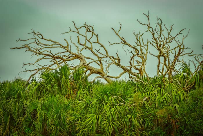
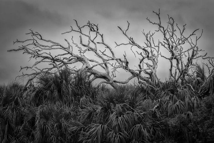
Seeing In Black And White
As one who really enjoys black and white photography, I admit I get frustrated when someone suggests that you “try black and white, maybe that can rescue the color photo”. This treats black and white as an add-on or afterthought to color photography. For me, black and white should be made with deliberate intent to take you to a destination different from color. This deliberate intent all starts with seeing the scene in black and white, visualizing what the final outcome will be. Although our eyes physically see color, we can train our mind to see, to visualize in black and white.
A Few Questions
Let’s start our discussion with a few questions:
- Have you seen photos that look better in color than in B&W?
- Are there photos that look better in B&W than in color?
- Do some photos look good in both color and B&W?
The usual response to all 3 question is an unequivocal “yes”. Question 3, in particular, makes us ask a follow-up question: If you’ve seen photos that look good in both color and B&W do you like both versions for the same reason? The answer to the follow-up question is usually a resounding “no”. Understanding that there are differences between a good black and white or a color photo, we can learn to look for those characteristics, or attributes, when deciding between black and white and color. Recognizing these characteristics beforehand also allows us to compose and process the photo to take advantage of and emphasize those characteristics. This means we are making photos in an intentional manner to produce what we visualized rather than depending on luck to get a good photo.
Let’s Experiment
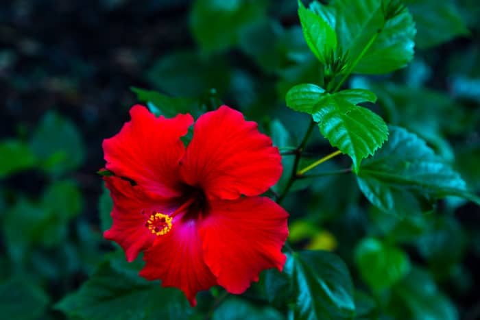
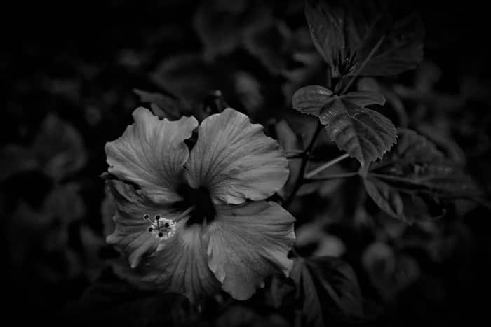
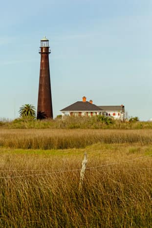
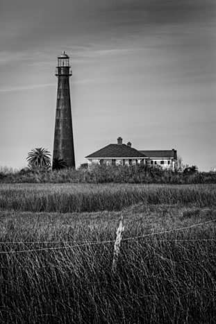
Let’s try an experiment in seeing in black and white as we view a series of photo. In the slider below are 8 photos. These are 4 different scenes each in both black and white and color.
- Using your mouse click through the series.
- For each photo list the attributes that immediately grab your attention.
- Describe what attributes you see
- Examples: color, tone, texture, mood, emotion, light & shadow, contrasts, complementary color, lines, shapes, patterns
- Describe the attributes, not the subject
- Don’t overthink this – give your immediate reaction – if it takes more than a few seconds to see an attribute, you’re overthinking it.
- Describe what attributes you see
You may notice that this process is very similar to how we refined our view of what is “interesting”. It’s all about allowing our natural reaction to a scene tell us what is significant and important in the scene.
What Are The Attributes Of Black and White Photos?
Some of the more commonly cited attributes of good black and white photo include the ones in the following list. Generally black and white is better than color in emphasizing these attributes. Note this is not absolute, some color photos can do a good job in regard to these attributes.
- Tonal range – Tone is the result of mixing a pure color with any neutral/grayscale color including the two extremes white and black. Black and white photography is especially well suited to show the full tonal range from pure white to pure black. B&W also brings out the subtlety in tones in the image.
- Contrast – Contrast is the difference in brightness between light and dark areas of an image. Black and white, as is implicit in the name, highlights this difference.
- Light, shadow and chiaroscuro – Black and white photos work well with highlighting light (lower tonal values) and shadow (higher tonal values) and also the values in between as we go from light to dark (chiaroscuro – an effect of contrasted light and shadow created by light falling unevenly or from a particular direction on something). This often goes hand-in-hand with tonal range.
- Texture and details – Side lighting produces surface shadows and contrasts emphasizing a three-dimensional texture portrayed in a two-dimensional photo. Black and white makes texture and details more noticeable.
- Dark spaces – Dark spaces create a sense of mystery especially when used as negative space in the composition
- Mood – Maybe I’ve seen too many film noir movies but black and white just seems to set a mood better than color.
- Convey Strong Emotion – Color can overpower other attributes in a photo masking our ability to see and appreciate those other attributes. Removing color allows the other attributes to become more apparent and to create a mood and emotional feeling. An example is Dorothea Lange’s famous Migrant Mother photo. Compare the black and white version with the colorized version. I would argue that the black and white has a much stronger emotional appeal

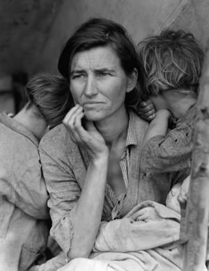
Migrant Mother – Dorothea Lange photographer
Colorized by John Boero
Wikimedia Commons
- Fewer distractions – Black and white can help focus our attention on the subject by de-emphasizing the background colors. Bright or varying colors can draw our eye away from the subject. Black and white processing is similar to the use of depth of field (or even combined with depth field) in helping to focus your attention on the subject. The Migrant Mother image above also demonstrates this. I’ve seen this iconic photo many times but it wasn’t until I saw the colorized version that I fully realized she was holding an infant. The black and white version helps maintain the focus on the mother’s face, the source of the emotional impact. Fewer distractions mean more emphasis on the subject.
“Color is pretty, so you get pretty shots. In black and white, you have to have a subject.” Fred R. Conrad NY Times Staff Photographer, 1983
The Practical Application
This brings us back to the question of “How do we go about seeing in black and white?” to know if our subject is a good candidate for black and white. Although our eyes cannot physically switch from seeing color to seeing black and white, they can see the attributes of the scene. These attributes are what give us a clue as to whether or not a particular scene might work well in black and white.
Our earlier experiment in identifying the attributes is a good training exercise. Try this the next time you go out shooting – close your eyes and when you open them immediately assess the characteristics of the scene the grab your attention. Over time, you will learn to recognize attributes that could lead to a good black and white photo and soon you will automatically be seeing in black and white without having to go through the exercise.
What About Using Picture Style?
Some people advocate making the decision on going to black and white by changing the Picture Style [for Canon, Picture Control for Nikon, Creative Style for Sony] setting to monochrome and then reviewing the image on the camera’s display. You can adjust settings for sharpness, contrast, filter and toning. If you are comfortable doing this and willing to take the time to iteratively adjust the settings and reshoot then by all means use it if you feel it helps.
Personally, I don’t use this method. I find it to be extra work and frankly, not all that helpful. Simply converting an image to black and white doesn’t mean you’ll get a good black and white photo. The conversion is the first step in making a good black and white. By no means is it the last step. There are a lot of things that often are required after the conversion. I believe it is better to make a decision on going to black and white on your visualization of the final image rather than on viewing the initial image. Deciding based upon the initial, unprocessed image may mean you give up on black and white too soon and miss the opportunity to create a great photo.
Leave A Comment
I’d love to hear your comments and feedback on this post. I hope it was helpful.
How do you decide whether or not to make the photo in black and white? Please leave a comment in the comment box below.


