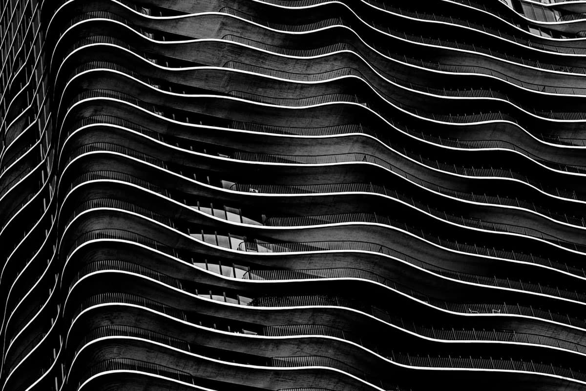
Aqua A Chicago Landmark

Known for innovative and experimental architecture Chicago is a great town if you love architecture. Famous architects such as Louis Sullivan, Daniel Burnham, Ludwig Mies van der Rohe, and Frank Lloyd Wright, just to name a few, have buildings there. It is home to stunning buildings; the Rookery, the Sullivan Center, Union Station, Willis Tower, the Robie House, Tribune Tower, Marina City, Chicago Theater, and on and on. Aqua is one of Chicago’s newer and more innovative designs. It’s also what’s made Aqua a Chicago landmark.
The Aqua skyscraper is an 82-story mixed-use residential skyscraper in the Lakeshore East development in downtown Chicago. Completed in 2009, it was designed by a team led by Jeanne Gang of Studio Gang Architects. Aqua was designed with irregularly shaped concrete floor slabs which create an undulating, sculptural quality. Gang cites the striated limestone outcroppings that are a common topographic feature of the Great Lakes region as inspiration for these slabs. I think it also creates a feeling of flowing water and ripples, very apropos for a building called “Aqua”.
The Composition
Aqua in not a traditional building. Therefore, I didn’t want to take a traditional architectural shot. The traditional shot of showing the entire building with the perspective controlled to keep the vertical elements truly vertical just doesn’t do this building justice.
I chose to do a tight shot that filled the frame with the building to emphasize the sculptural aspects. I also deliberately angled the image to de-emphasize the fact that this was a building so you would first see the sculptural aspects and go with the “flow”.

(Click to enlarge/purchase)
Taking The Shot
The gear and settings were:
- Canon 5D Mk III, Canon EF 24–105mm f/4L is II USM Lens at 105mm
- 1/320 seconds at f/9, ISO 100, hand-held
Taking this shot was pretty straightforward. I shot it hand-held and framed the image in the viewfinder.
Post-Processing
As always, I started in Adobe Lightroom with basic edits and checked for sensor spots etc. Taking the image into Photoshop I increased the saturation to give it more “pop”. I also toned down some overly bright areas and brought up a few dark areas. Since I wanted to concentrate the view in one specific area, I cropped it from a portrait orientation to a landscape. Yet even with the tighter framing and deliberate tilt the windows and balcony railings still make it clear that this was a building.
Since I wanted to put the emphasis on the sculptural and flow aspects, I converted this to black and white using Nik Silver Efex. As a result, strong white flow lines for the edges of the floor stand out against the darker other aspects. You can still tell this is a building. However, with black and white the first and major impression is the white flow lines. The final adjustment back in Photoshop was a Levels adjustment to maximize the tonal range.
Please Leave A Comment And Share
If you liked this post, please share on Facebook and Twitter and comment below. How have you decided to photograph unusual buildings? Please leave a comment in the comment box below.
