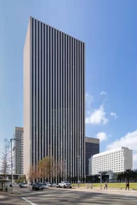
Striped Reflection At 601 Jefferson
Although a reflection may be clearly visible, we often don’t “see” it. We subconsciously block it from our view. The reflection’s beauty and potential are lost to us. However, sometimes a reflection perseveres and commands our attention. It is in that moment we find our reward. My recent shot of KBR Tower is an example of this.
601 Jefferson – KBR Tower

The 601 Jefferson building (now known as the KBR Tower) in Houston is a great example of simplicity in architecture. Its elegant design is still apparent despite its age of nearly 50 years. The building is a simple rectangle. The facades are a repeating vertical-striped pattern of light-colored columns separating dark-colored windows. There is no grandiose, awe-inspiring entrance; just single doors in line with the window columns. Additionally, there are no artistic foundation elements designed to convey strength and stability. The columns of stone and glass go directly to the ground. It’s as if a saw-tooth patterned die was laid upon the ground and the building was extruded up 550 feet into the sky. It is a simple and effective design. Because of this, it is elegant.
“Simplicity is a choice, a discrimination, a crystallization. Its object is purity.”
– Le Corbusier, Swiss-French architect and designer
The Shot
The simplicity of the building is what first drew my attention. My original vision was a black and white image emphasizing the striped pattern of dark glass and light-colored stone. However, as I started processing the shot the strength of the reflection kept grabbing my attention. Although a reflection may be clearly visible, we often don’t “see” it. We subconsciously block it from our view. The reflection’s beauty and potential are lost to us. However, sometimes a reflection perseveres and commands our attention. It is in that moment we find our reward.
Rather than the contrast of the light and dark columns, I was drawn to the two images presented. One was of the KBR tower and the other was the reflection of the glass and steel tower behind me. Additionally, processing in color really seemed to bring out the contrast between these two. For me, the lesson was that even though you start out with a vision sometimes the scenes demands that you shift to what it wants to give you.
In the interest of full disclosure, my chosen composition is the back (Pease Street) façade of 601 Jefferson. Both facades are the same but the sightlines are better on Pease St. and the trees add a nice softening touch. Plus, it does have that great reflection!
Another Lesson in Perseverance
Photographing the KBR Tower was yet another lesson in perseverance. It took 8 trips downtown over a period of 10 months to get this shot. During this time, they were doing building maintenance that involved the use of a window washer’s suspended scaffolding. All the gear and activity just didn’t work for a good shot. Each time I went there and spotted the scaffolding I just drove on by, never even getting out of the car. At some point, it became something of a personal crusade. I was determined to get the shot.
Finally, my perseverance paid off. When I returned again in December, the scaffolding was gone. I went there in the early morning as I thought I would get some interesting shadow effects. However, to my back was a glass and steel tower oriented at a 45-degree angle to the façade of the KBR Tower. As a result, direct sunlight reflected back onto my subject creating a very splotchy and unappealing look. It would take yet another trip.
So, I returned again January. I determined a time when the sunlight wouldn’t be reflected directly back onto the building using the Photographer’s Ephemeris. No more splotches! The New Year brought me luck and with my 8th trip I was able to get the shot. It was a long process but I’m glad that I persisted.
Genre Blending
Another reason I like this composition so much is that it’s a blend of two of my favorite genres of photography; architecture and street photography. The architectural aspects are from the emphasis on the building. By this I mean how it fills the frame and highlights the pattern of its design. At the same time, including a person walking by argues for calling it street photography.
It’s hard to say how I should classify this. Fortunately, I’m not really that concerned with labels. “A rose by any other name …” and all. But then, why can’t it be both? That’s the way I think of it.
Leave A Comment And Share
How do you go about achieving simplicity in your photographs? I’d love to hear your comments and feedback. Please leave a comment in the comment box below.


