Smith Street
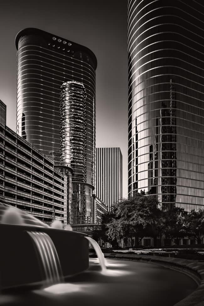
Smith Street is home to iconic Houston architecture. These two glass and steel towers have become landmarks with their reflections of the Houston skyline. Although similar in design they each have their unique characteristics. These buildings are now the home for Chevron Corporation’s Houston operations. But it was the former tenant that brought these building wide national attention. The Enron accounting fraud scandal attracted a lot of news cameras, all coming to Smith Street to use the buildings as a beautiful backdrop. A sad history, but that doesn’t take away from the beauty of the two buildings.

(Click to view gallery/purchase)
The Composition
This photo was taken one block north of the two buildings. I set up at the edge of the Bob And Vivian Smith Fountain to use as a foreground element. The wide variety of lines are fascinating. On the two buildings the banding lines offer beautiful contrasts. The lines on the parking garages along Smith Street form nice leading lines into the photo stopped by the vertical lines of the building in the center. On the fountain we see the lines of water pouring from the multiple outlets on the upper portion into the pool in bottom layer. The pool also as a line of splash areas that act as leading (dotted?) lines into the image.
I wanted a long exposure to smooth the water of the fountain so that would form a textural contrast with the midground containing the buildings. I also liked the trees as they also contributed textural contrast. This textural contrast between the foreground and midground helps to emphasize the buildings as the subject. Likewise, the background of empty sky also offers textural contrast with the buildings, again emphasizing them as the subject.
Given where I chose to setup and the focal length of the lens even at maximum shift, I could not get all of the building on the right in the frame. To do so I would have had to move back quite a bit and then crop out the bottom portion. Showing the entire building didn’t seem to add much in terms of impact. In fact, it seemed this would take away from the sense of closeness. As a result, I deliberately chose not to move back and accepted the “chopped” building. Photography is all about making choices.
Taking The Shot
I set my camera on a tripod at edge of the fountain, at a height of about 3-feet so I would be close to water level of the pool. The gear and settings were:
- Canon 5D Mk III, Canon TS-E 24mm f/3.5L II Tilt-Shift Lens at 12mm vertical shift, Induro AT013 tripod, Induro BHL3 tripod head, Shutter Release Cable, 9-stop neutral density filter
- 60 seconds at f/22, ISO 100, mirror lockup setting used to minimize vibration
The use of mirror lockup and a shutter release cable may be small details but I like to do everything I can do to get a good image. The effort is minimal so why not do all that can be done?
Post-Processing
I had carefully levelled the ball head as best I could with a small carpenter’s level when I took the picture. In Adobe Lightroom I double checked the vertical alignment and made very minor perspective corrections. I then checked the entire image at 100% magnification to remove any sensor spots and dust. At this time, I also adjusted the crop slightly to make the final composition. Finally, I made basic exposure adjustments.
Taking the photo into Adobe Photoshop I removed some minor distractions and did dodging and burning to brighten or darken certain areas. To convert to black and white I use Nik Silver Efex starting with Low Key I preset. Within Silver Efex I used the Color Filters and Film Color Sensitivity sliders to adjust the underlying color and the resulting tone in black and white. Back in Photoshop, I tweaked the exposure settings. I also decided to add a very slight warming filter to warm the overall feel.
Finally, I reviewed the overall image. The top of the building with the vertical lines seemed seemed to slope slightly down on the left side. This was a perspective effect resulting from the axis of my camera lens not being perpendicular to the building. The issue is that since the angle was so slight it looked strange. In situations like this our eye accepts perfectly level or major deviations. Slight deviations confuse our eye – is what I see correct or is it abnormal? To offset this, I used the Perspective Warp Tool to level the top of that building.
With the image back in Lightroom, I again checked for sensor spots and dust. Sometimes the processing we do makes previously “invisible” spots more visible. It’s a good final check procedure.
Have A Comment?
So, that’s how I created my Smith Street photo. What kind of processing do you follow for your architectural photos? Please leave a comment in the comment box below.

