Structural Abstraction
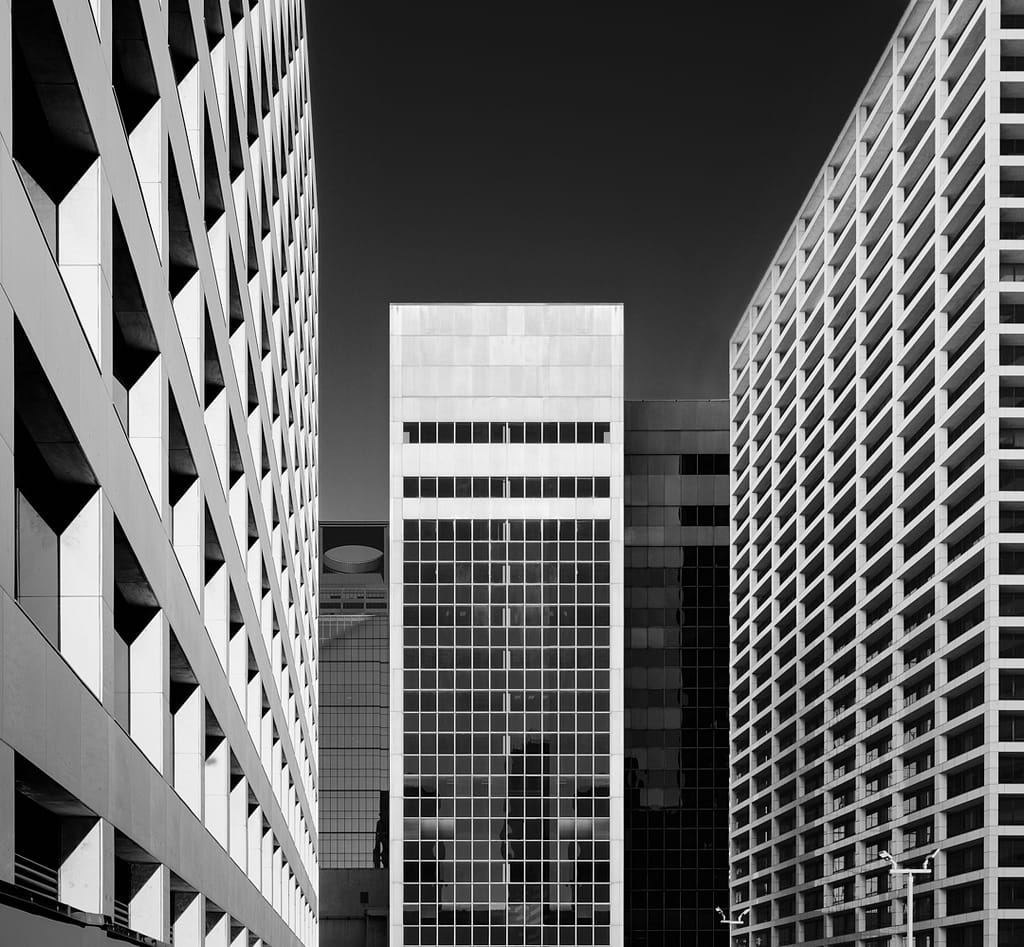
Structural Abstraction is an image that took a long time and unusual path to produce. While out taking another planned image in October, 2019, this composition caught my eye. I took several shots but none quite worked out like I hoped. Nonetheless, this composition stuck with me. I remained determined to try it again.
“Again” turned out to be March, 2022 but it unfortunately got off to a disastrous start. I was completing my setup when I made a serious rookie mistake. I failed to fully secure my camera on the tripod and it went crashing to pavement. Fortunately, the damage was not too severe. This allowed me to fix it locally at a reasonable cost. Finally, a few weeks later with my camera back in working order I was able to get the shot. However, it did take me until July to process it into what I had visualized.
The Shot
What drew me to this composition was the two similar buildings on the left and right that pulled you into the shapes presented by the 3 buildings in the center. Although, the 3 buildings are separated by distance, they appear somewhat “flat”. A canvas of lines and shapes if you will. I was shooting from an elevated position. As a result, the typical ground floor/entrance distinctions were not visible. Because of this, only the repetitive patterns and shape of the buildings are visible. For me, this is not an image about any particular building or even about architecture. Rather, it is about the lines and shapes we see all around that form beautiful abstract compositions.
Positioning the camera took quite a bit of effort. I wanted the building in the far distance with the opening to the sky on the top to be perfectly centered between the 2 white buildings. As a result, I made some compromises regarding the other buildings. However, I could not get the exact shot I wanted as I had run out of real estate from which to take the shot.
So Why Did It Take Four Months To Process?
The black and white processing was straightforward and didn’t take that much time. However, the composition did not seem right. I started to have a love-hate relationship with the image. One second, I really loved how it pulled me in. The next second, it just seemed, well, rather boring. I decided to walk away for a while. It needed to marinate.
Earlier this month I revisited the shot. I realized that I needed to narrow the focus and cropped it significantly. Unfortunately, this still did not get it to where it needed to be. Knowing, the value of good critique, I submitted it to a critique forum on 1X.com. The suggestions were to make an even tighter crop and to remove the shadows on the center white building. These helped dramatically but there was still something wrong.
Those compromises I mentioned earlier that were the root problem. I was letting the “rules” of architectural photography dictate the composition. The “rules” were about the need to show depth by showing the side and not letting the buildings share a common edge, the edges should overlap to convey depth.
This is an abstract shot. It is not an architectural shot. Therefore, I did not need to pay attention to the “rules”. With some simple Photoshop adjustments, I was able to remove appearance of depth and achieve the true structural abstraction I was after.
Sometimes achieving your vision does not come easy or quick. But it is always worth the patience and effort.
Leave A Comment And Share
Have you ever had a photo you struggled with getting to look like your vision? I would love to hear your comments and feedback. Please leave a comment in the comment box below.


