MD Anderson Cancer Center
The MD Anderson Cancer Center is one of the largest cancer treatment centers in the world. More importantly, it is considered one of the best. Given this status it is befitting that the architectural design of their main building is eye-catching. However, it is not “over the top” or extravagant. After all, it is a non-profit organization and I think we’d all prefer that their money goes to curing cancer.
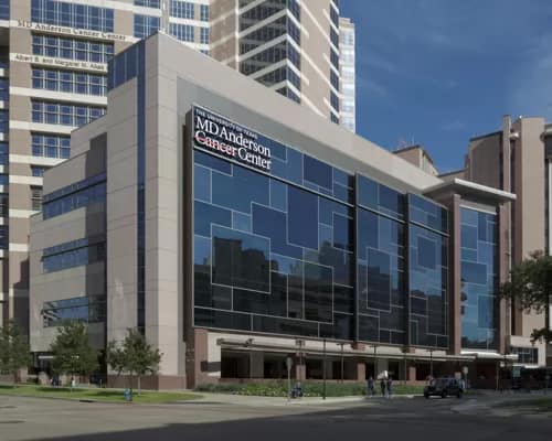
The front façade is a number of “blocks” of various shades of blue. Each block is outlined in a lighter color metal creating a great contrast in color tones. This potential for contrast is what caught my eye.
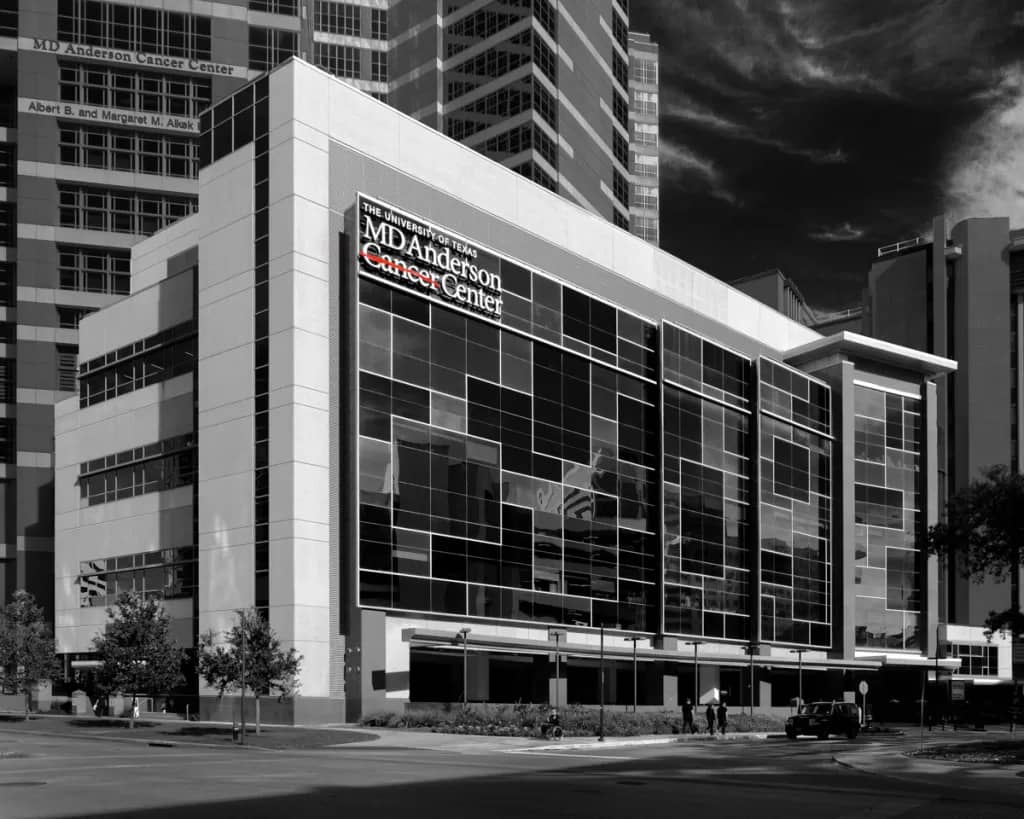
I was torn between doing this in color or black and white. The color version shows the beautiful blue tones. However, it lacks that certain “pop”. For me, it comes across as a nice magazine image but doesn’t excite your eyes and imagination. That is why I decided to go with black and white to emphasize the contrasts. But I should also admit I have a bias towards black and white.
The Shot
Normally for this type of composition I use my tilt-shift lens to control the vertical perspective. This also requires the use of a tripod. However, this time I didn’t have either of these with me. Now some may say I should have waited till I had the “right” gear. But I’m a believer that the “right” equipment is the gear that you have with you. The conditions (light and clouds) were perfect and who knows if I’d ever catch this opportunity again. So, I took the shot with a zoom lens making the composition extra wide knowing I’d lose some of the image when I corrected the vertical perspective in post-processing. Here’s the shot.

So, What’s With The Strikethrough?
You may have noticed that the word cancer on the front façade of the building has a strikethrough line over it. For over 70 years the mission of MD Anderson has been to eliminate cancer. A strikethrough is a typographical presentation of something that should be deleted. This matches well with the MD Anderson core mission. In 2010, they changed their branding to include a red strikethrough line over the word cancer. It was a move that beautifully illustrates their commitment.
Normally, I’m not a big fan of selective color in black and white photos. It can seem a bit gimmicky. However, in this case, I decided to keep the strikethrough line red. If I left the image fully black and white the significance of the line would be lost and could be confusing.
Leave A Comment And Share
What’s been your experience with taking photos without the “right” gear? I’d love to hear your comments and feedback. Please leave a comment in the comment box below.

