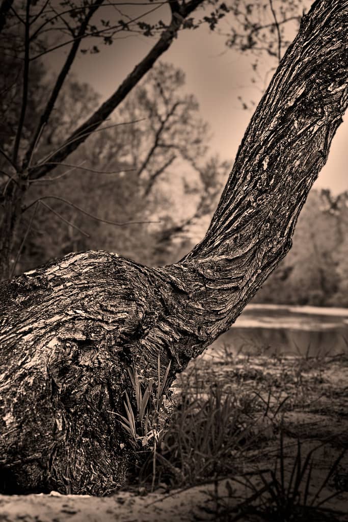
Bent And Twisted Tree
There’s something special about trees that makes them such wonderful photographic subjects especially if it is a bent and twisted tree. They are so many shapes, forms and textures. Trees are majestic in life and in death. There is simply a beauty to them that draws us like a moth to a flame. For a variety of reasons, I haven’t been able to do a lot of shooting in a while so when friend and fellow photographer, Lisa Griffis, suggested we go to a place she knew of along the San Jacinto river I jumped at the chance. As we walked along the river, Lisa was first to spot this tree. Bent and twisted, it still clung tightly to its place on the sandy river bank. It survived numerous floods and its shape indicated it wasn’t a life without difficulty. But it prevails and therein lies its beauty.

(Click to enlarge/purchase)
The Composition
I chose to focus on the base of the tree because of its unique form and textures. I really like how it was bent and twisted which really gave character to the tree. Because of its shape I framed the trunk diagonally to lead your eye into the frame and to emphasize the subject.
Taking The Shot
The gear and settings for this shot were:
- Canon 5D Mk III, Canon EF 85mm f/1.4L IS USM Lens
- 1/60 seconds at f/4.5, ISO 100, handheld
The tree is located on a small, sandy plateau about 5 feet above the “normal” water level but still well below the top of the river bank. As such, it has a natural separation from the water while still close to it. For this reason, I chose a relatively shallow depth of field.
Post-Processing
I started the post-processing by creating a selection of just the bent and twisted tree. Using this selection, I brightened the subject tree along with increasing the texture and contrast settings. To further, increase the attention on the subject I darkened the background using the inverse of the tree selection. While working with the background I decided the f/4.5 aperture was too small as some of the small branches above the tree on the left were still pretty sharp. For this reason, I used the inverse of the tree selection and applied a gaussian blur in Photoshop to increase the background blur. As a result, this both emphasized the subject through the sharpness of the subject and by creating a nice separation between the background and the subject.
Monochrome Processing
Since I was emphasizing the bark texture I decided on black and white processing as it eliminates color distraction thereby drawing attention to the texture. I used Nik Silver Efex to convert the image to B&W and used the Fine Art filter (sounds rather pretentious don’t you think?) in Silver Efex. I used the green filter to slight lighten the tone of the foliage and made other minor adjustments to contrasts and highlights. At this point the image struck me as having a old-time look so I decided to further emphasize this by converting it to sepia by using a warming filter in Photoshop.
A Different Vignette Style
I also added “vignette”. Rather than a standard rounded vignette in all four corners I chose to add a vignette from the top-left and bottom-right corners. I brought them in straight from the corners at an angle roughly parallel to the angle of the trunk. I accomplished this by creating a copy of the image layer and lowered the exposure and positioned it to be below the image layer. Placing a layer mask on the image layer and I created the vignette using a liner gradient tool in Photoshop,
The final adjustments consisted of tweaking the highlights and contrasts on the trunk via dodging and contrast adjustment in Photoshop using the original tree selection.
The Value of Critique
At this point I was close to being finished with this image. However, something didn’t feel right. I had a love/hate relationship with it. The old-time feel of the photo and the composition was great but it was lacking something. I was stymied.
Getting good feedback and critique from trusted and knowledgeable people can do a lot to improve your photography. I needed some help to get past my blind spots. Fortunately, I belong to a Critique group at my local camera club. Group members had two great suggestions. First, I should increase the exposure and contrasts on the trunk to make it pop. Second, my vignette was too severe. The vignette needed to be more subtle with a longer gradient transition.
I took a look at these suggestions and they were right. I’ve incorporated them in to the image shown above. As a result, the image has changed from a throw-away to one the I now really like.
Leave A Comment And Share
I’d love to hear your comments and feedback on this post. I hope it was helpful. Have you ever received critique that has improved your photos? Please leave a comment in the comment box below.
Also, if you like this post please share on Facebook and Twitter.
