McKinney Falls State Park – Lower Falls
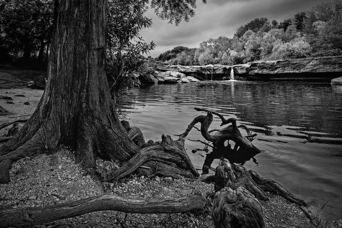
My wife and I decided to get out Houston for a few days to take in the beautiful Texas Hill Country. On the drive there we stopped at McKinney Falls State Park in Austin. Located at the confluence of Onion Creek and Williamson Creek, these creeks join and meander through the park over limestone formations and two waterfalls. In the grand scheme of waterfalls, these two falls aren’t jaw-dropping spectacular. The falls are about 15 feet in height. What they lack in height and drama they make up for by completing the scene; rock formations, trees, quiet (normally) streams and a waterfall or two.
A traditional waterfall shot has the waterfall filling a major portion of the frame. I chose to show the Lower Falls encompassing the entire scene since the falls by themselves are relatively small. The Lower Falls is still the subject, I just wanted to show it in context to its environment. Given all that, I needed to pay extra attention to some composition and post-processing techniques to indicate the falls as the subject.

(Click to enlarge/purchase)
The Composition

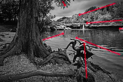
The composition I visualized was a low shot, close to the water with the cypress tree framing the waterfall and rock formation in the background. The knees of the cypress trees would add some nice foreground interest. Looking at the scene it had some natural leading lines I could use to guide the viewer’s eye to the falls.
Additionally, I didn’t want the tree to be the left edge. I wanted the entire width of the trunk to be visible with some “breathing room” to the left of the tree trunk. My intent was to avoid creating a literal “frame” using the tree. I accomplished this by placing the trunk near the rule-of-thirds left vertical line which nicely places the falls near the right rule-of-thirds vertical line. In this case, following the “rules” was beneficial.
I shot this photo in vertical aspect ratio. At the time, my reasoning was to make it consistent with the verticality of the tree, the falls and the major leading line through the cypress knees. However, the more I looked at this, the less I liked the vertical aspect ratio. The rock formations, much of the water, and the root in the lower left are horizontal in nature. In addition, the top part of the tree didn’t add much to the image and was something of a distraction from the subject. When looking at horizontal aspects, I noticed a nice diagonal line of the trees starting at the upper right corner. These last two items made the decision simple. The image looked better in a horizontal aspect ratio; so, I cropped it.
The Shot
The gear and settings I used for this shot were:
- Canon 5D Mk III, Canon EF 14mm f/2.8L II USM Lens
- 1/125 seconds at f/11, ISO 100, on tripod
I set the tripod about a foot off the ground very close to the cypress tree knees in the foreground. This positioning gave me the low angle I was wanting. By using the 14mm wide-angle lens I could get very close to the cypress knees and keep them in focus as my foreground elements.
Post-Processing

The initial phases of my post-processing were fairly standard for how I process my black and white images. The steps I took were:
- Minor adjustments in Adobe Lightroom
- In Photoshop I applied some sharpening, shadow and highlights adjustment along with vibrance adjustments.
- I converted this to B&W using Nik Silver Efex with the Low Key 1 preset
At this point in addition to some brightness and contrasts tweaks in Silver Efex I would normally use the yellow slider to lighten the tone of the trees in the background. However, this time I used an orange slider. I chose orange since it would also lighten the trees but also have an impact on the “beach” in the lower left corner.
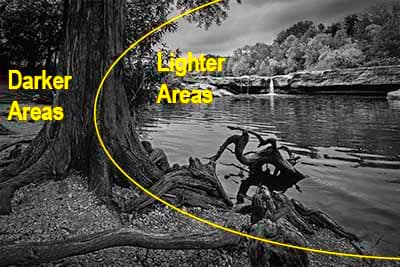
Reviewing the image, I decided to further emphasize the subject by darkening some areas while lightening others. This helps because our eye naturally goes first to the lighter areas of an image. To accomplish this, I applied some radial filter adjustments around the falls and trees in the background. I also darkened the large tree in the foreground and the beach area. Yes, I realize that means I, in effect, reversed my lightening of the beach that I did in Silver Efex. What can I say? Sometimes when you see a better way you need to adapt rather than stay locked into your original plans.
As I mentioned earlier, while getting up close and personal with this image for an extended period I decided that a horizontal aspect ratio worked better. So I cropped it. You have to be open to change and adapt as you work through the process. Finally, I finished the image with just a slight bit of vignetting.
Please Leave A Comment And Share
If you liked this post please share on Facebook and Twitter and comment below. How do you process your landscape images? Please leave a comment in the comment box below.

